
No products in the cart.
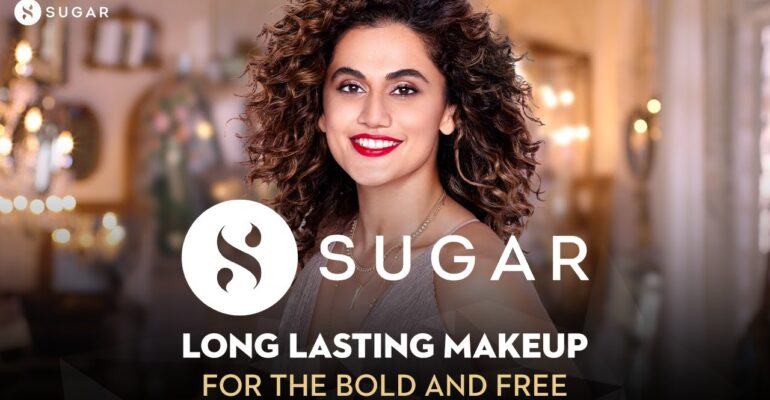
SUGAR Cosmetics – Vineeta Singh Secret Strategy
SUGAR Cosmetics is an Indian cosmetic brand, producing mid-range products with shades according to Indian Skin tones. The company was founded in 2015 by Vineeta Singh and Kaushik Mukherjee. SUGAR Cosmetics works on a hybrid model – having both online and offline presence. The company manufactures its products in India, Germany, USA, Korea, China and Italy.
Established in 2015, Sugar Cosmetics came up with just two products, namely, a black matte eyeliner and a black kohl pencil. Since then, the company has grown to 450 stock-keeping units. Surely, the company has adopted many marketing strategies to expand its growth.
3 Marketing Strategies of Sugar Cosmetics
The “FAB BAG”
The “FAB BAG”, a cosmetic subscription service created by Kaushik Mukherjee and Vineeta Singh in 2012. For Rs 599 every month, users would get a “surprise” beauty box including a mix of five goods from the categories of cosmetics, bath and body, skincare, haircare, and fragrances. These items were largely new and unknown brands that were sourced abroad. SUGAR wanted to position itself as a premium brand because the company’s growth depended on encouraging mass consumers to upgrade or luxury clients to try something less costly.
Reference link- https://youtu.be/MFC3zZTuEqg
Instagram influencers
The importance of Instagram influencers in beauty business marketing is well-documented. SUGAR jumped on the ‘unwrapping videos’ and ‘before and after’ makeovers to make people aware. The brand’s Instagram influencer approach is well-balanced. Anmol Rodriguez, an acid attack survivor, is featured in one of their most famous videos. Today, the brand has 1 million Instagram followers. Vineeta Singh also made us fall in love when she recreated the 3 idiots meme “Aal iss well”.
Reference link- https://youtu.be/BN5WfH7QHA4
https://youtu.be/gsuyXMJb9qw ,
Unique Packaging
SUGAR, like many other emerging companies, began with an all-digital strategy. The design partner, Opposite was given the task of creating “thumb-stopping packaging.” Opposite devised a strong, graphic approach that incorporates low-poly drawings, that can easily attract the attention of audiences and also aware that the challenger brand needs to appear and feel unique from the prevalent minimal and largely black style.
Reference link- https://youtu.be/5Sdd9Wa313k
Related News


March 3, 2023
How to do an SEO Competitive Analysis

December 25, 2022
Top Digital Marketing Agency in Balasore

December 13, 2022
The Success Story of Jeff Bezos | Amazon Secret Story

December 12, 2022
8 Business Lessons to Learn from Jack Ma

December 11, 2022
How to Create your Brand Strategy?

December 9, 2022
Step-by-step Guide To Social Media Marketing

December 6, 2022
Unacademy Case Study – Business, Marketing Strategy Tips

December 5, 2022
Bhavish Agarwal’s Secrets to grow your company – Ola Case Study
December 3, 2022
Rapido Case Study – Marketing Strategies | Delivery Startup

November 30, 2022
How to Run a Marketing Campaign?


November 28, 2022
Licious Case Study – Tricks to Attract New Customers in your Startup


November 26, 2022
upGrad – Ronnie Screwala Secret Strategies for Edtech Businesses

November 25, 2022
OYO Case Study – Seo tips for business by Ritesh Agarwal


November 23, 2022
Lenskart – Business, Marketing Strategy Tips for Local Businesses

November 22, 2022
PhonepPe Case Study – How payment companies market themselves ?

November 21, 2022
PepperFry – Marketing Strategies | Furniture Startup Marketing Ideas

November 21, 2022
Mamaearth – Business, Marketing Strategy Tips
November 20, 2022
Meesho Case Study: Business, Marketing Strategy Tips

November 19, 2022
Kellogg’ss – Business, Marketing Strategy Tips

November 18, 2022
H&M – The Brand Story | Business, Marketing Strategy Tips

November 17, 2022
Flipkart Case Study: Business, Marketing Strategy Tips
November 16, 2022
Colgate Case Study: Business, Marketing Strategy Tips
November 14, 2022
Pepsi – Business, Marketing Strategy Tips

November 13, 2022
PharmEasy – Business, Marketing Strategy Tips

November 12, 2022
Zomato Marketing Case Studies – Dark Secrets of the Brand

November 11, 2022
Urban Company – Business, Marketing Strategy Tips Urban Company

November 10, 2022
Dream 11 – Strategy of a Digital Brand

November 10, 2022
Starbucks – Business, Marketing Strategy Tips

November 6, 2022
BigBasket Case Study: Business, Marketing Strategy

November 6, 2022
ZARA – The Brand Story | Business, Marketing Strategy Tips

November 5, 2022
BharatPe Case Study: Business, Marketing Strategy

November 5, 2022
Nykaa – How a 50 year old lady created a billion dollar startup

November 4, 2022
ShareChat – Strategies of a Internet Company
November 3, 2022
TATA Group Marketing Strategy | Ratan Tata’s Secret Strategies

November 2, 2022
Coca-Cola Case Study: Business, Marketing Strategy Tips


December 28, 2021
Simple Tricks To Grow Your Local Coaching Institute
December 25, 2021
How You Can Build Brand with Low Budget ?Low cost Branding Model.

December 20, 2021
najlepszy sklep
Wow, fantastic blog format! How lengthy have you ever
been running a blog for? you make running a blog look easy.
The overall look of your website is magnificent, as smartly
as the content! You can see similar here sklep online